Just about any image can always be improved with manipulation of the colours – saturation, contrast etc. There are often areas in a picture that lack punch or detail such as the sky or textiles. The goal we are chasing is to get an even feel to the image, focusing on areas that may be too light or too dark, and to create something that is more pleasing to the eye than the original. Imagine if the image was going to be printed to a major size to hang on your wall. Unless this refinement was executed, you are almost certain to get a print with noticeable weak areas.
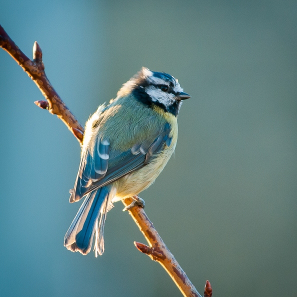
I have created our first 10 minute video tutorial which illustrates how a few gentle adjustments can make a photograph much stronger than the original in every sense. I am using Adobe Lightroom 4, which is a very powerful program, but far simpler to use than Photoshop. For tweaking images to perfection, and when you don’t want to make any major overhauls to a picture, such as moving granny ten paces to the left, it is all you need. The image is of a Blue Tit, and it is the sort of image that would make a great birthday card for the aforementioned granny. So let’s see what we can do!
This is best viewed on YouTube at the highest settings on offer with the screen maximised, so click the small gearwheel when the video starts, choose 720HD and click the YouTube logo to ‘Watch on YouTube’. Maximise the screen.


Posted on August 20, 2012
0